


Hello my scrappy friends,
Today, Id love to share with you my latest creations I made for the current Australian Scrapbook Ideas magazine.
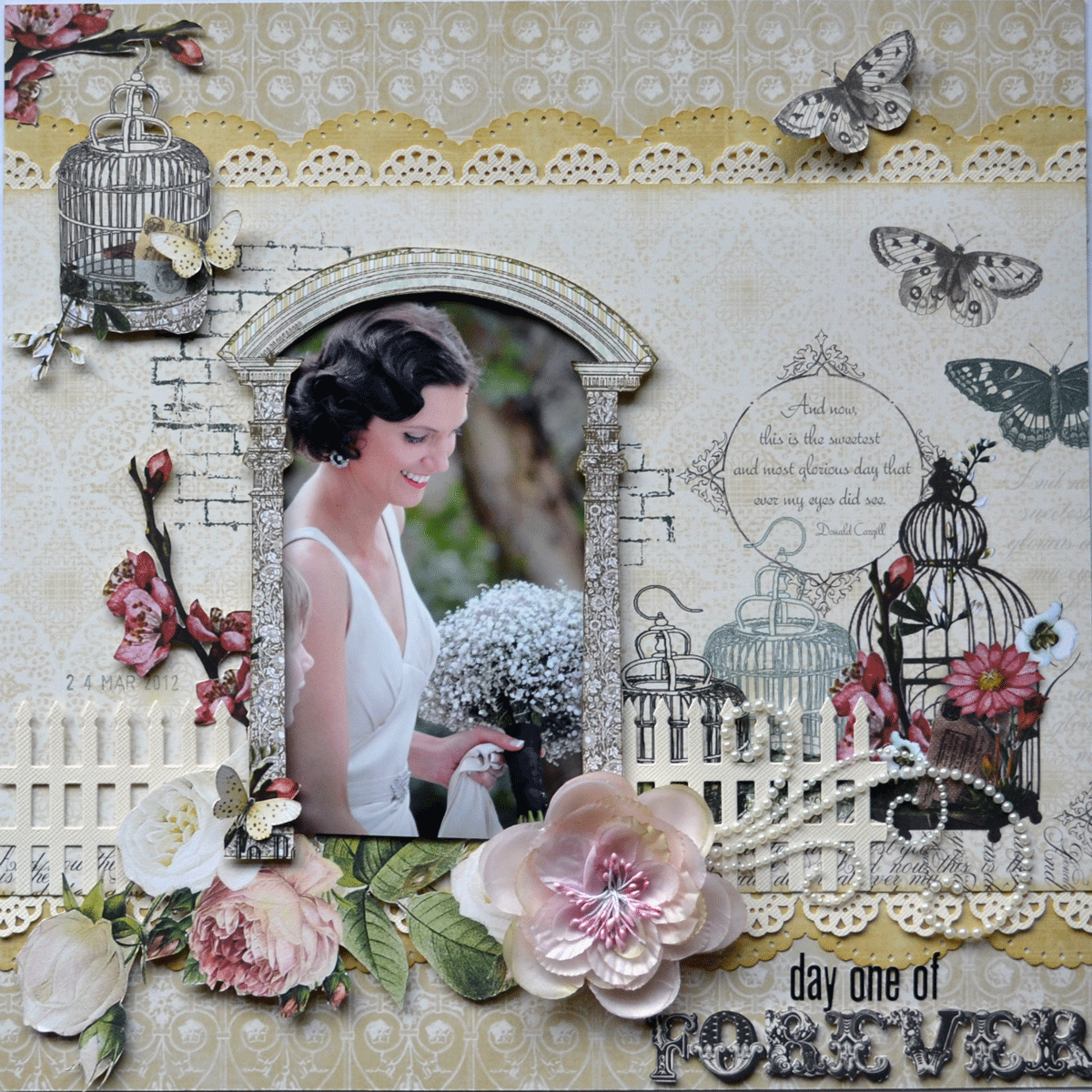
BUT first up, I have some good advice for you !!!! Check out the photo below from the ASI mag of one of my layouts..... Can you see anything weird looking ???


I certainly can.
Heres what happened. The middle photo, which is WAY UP THE TOP of the layout, soooo shouldnt be up there !!!! It has obviously come unstuck during the trip up to QLD to be photographed by ASI, they didnt pick up on it before photographing, and now obviously theres nothing anyone can do once its been printed :( SO. my advice is ALWAYS MAKE SURE YOU STICK STUFF DOWN PROPERLY, and WHEN SENDING YOUR WORK IN, ALWAYS INCLUDE A PHOTO OF YOUR LO WITH IT !!!!
Anyway, so heres what the layout is supposed to look like, much better I think LOL.

All 3 of these layouts are very YELLOW, in case you didnt notice LOL. ASI has started a colour focus segment each month, using a new range of papers each time. My colour was YELLOW (yep, surprise), and I had to use Authentique 'Blissful' papers. I tried to show 3 very different styles of scrapping here, so Ive done a masculine LO, a rustic type, and a very feminine LO as well.
This next one is my favourite, I LOVE the way the title looks, cut from the photo ( theres a step by step tutorial on how I did this in the mag) But, I will share the technique here too a little later on.

And this last layout is a very feminine one, using some Pink Paislee 'Sweetness' papers ( I have used this paper on so many projects) Its a lovely photo of my niece Zoe.

Thanks so much for calling in, and thankyou to everyone who leaves me a comment. I do try to get round to everyones blogs, but we are in the country here, and our internet connection is a bit dodgy to say the least, sometmes it works, other times not !! ( especially if it is overcast, or raining) It is very frustrating. But when it does work, blog hopping is the first thing on my agenda.
Have a wonderful Sunday


Very good advice Karen :) Love the layouts - wow that title cut from the photo looks fab....and what a great photo it is too. Love the design of the last LO - the yellow totally pops - stunning!
ReplyDeleteI just sent something in to Northridge publishing to be in the CARDS mag in August. They request that you send a color copy of your project. Your LO is cute. The last one is beautiful. I love the punched border and the stamping and doily. So girly feeling.
ReplyDeleteROTFL .... I have a whole butterfly missing off my layout on page 29 of this months mag! All you can see there is a bit of ripped paper where it was supposed to be!! Bhahahahahaahah .... I'm sure it's entirely my fault for not sticking in on properly, so from now on I think I'll stick my embellies on with a glue gun!! Loved all your pages Karen ... yellow is a hard colour to work with, but you have done so beautifully as always. xoxo Kel.
ReplyDeleteWow Karen they are all gorgeous layouts! I love all the yellow, but my favourite is the Fields of Gold layout. It is stunning! The picture is stunning lol!
ReplyDeleteHOpe everything is going well with Manor House :o) xo
HI Karen... that is good advice... I will remember that for the future.. It is a pity they didn't pick it up... never mind!! I love all three layouts.. yellow is a color that should be used more, it looks so cheerful i think.. and I understand about the internet.. we have a wireless modem here for my daughter and when she is on her laptop as well our internet slows right down... so annoying!! Heres hoping we all get faster internet in the future!! enjoy your sunday!!
ReplyDeleteHi Karen, I didn't even notice (so in awe of your work I guess I don't see faults). I love the ASI magazine so will continue to purchase.
ReplyDeleteIt's so sad that your picture got stuck up there...but I love it anyway.......love them all so much....you are such an great artist hugs Amy :)
ReplyDeleteGosh - Fields of Gold is stunning! Where is the photo taken? It's such a refreshing change to see a layout where the majority is the photo (the whole point of it all really!). Glad to have discovered your blog! Happy Easter!
ReplyDeleteOh how annoying for you Karen! Gorgeous layout anyway and all the yellow is just STUNNING! Love your work :)x
ReplyDeletelove, love, love the ratbag layout ... simply gorgeous ...
ReplyDeleteGreat layouts. I like the use of one particular colour theme . Love the yellow. x
ReplyDeletevery very beautiful pages...
ReplyDeleteOh gosh shame! Well thanks for the great advice - I will definitely include a photo so they can compare LOL!! Anyway, they are all too beautiful :)
ReplyDelete